Arbutus, Amarante & Pompiere
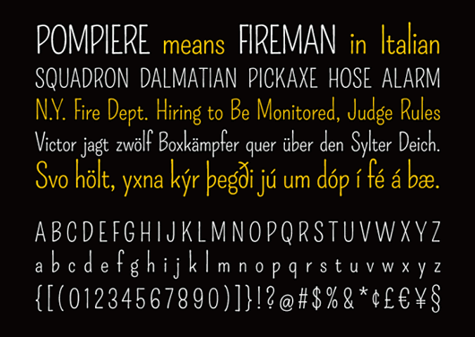

Pompiere

The lovely Pompiere is our favourite of the bunch, a beautiful hand-drawn style but remaining elegant and readable.
Pompiere is a narrow sans-serif typeface that takes its inspiration from a handlettered sign found outside of a firehouse in New York City. It combines the qualities of delicate, handwritten craftsmanship with subtle Art Nouveau-inspired details and proportions. These characteristics combine to lend the typeface a friendly, unassuming atmosphere.
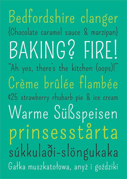
Amarante

Amarante is an elegant, narrow serif typeface whose allegiances sway between the fluidity of botanical Art Nouveau forms and the vaulted, rigid lines of a gothic cathedral. Its bold, highly stylized forms lend it an air of eccentricity and sophistication, while its tall x-height ensures its readability even at small size.
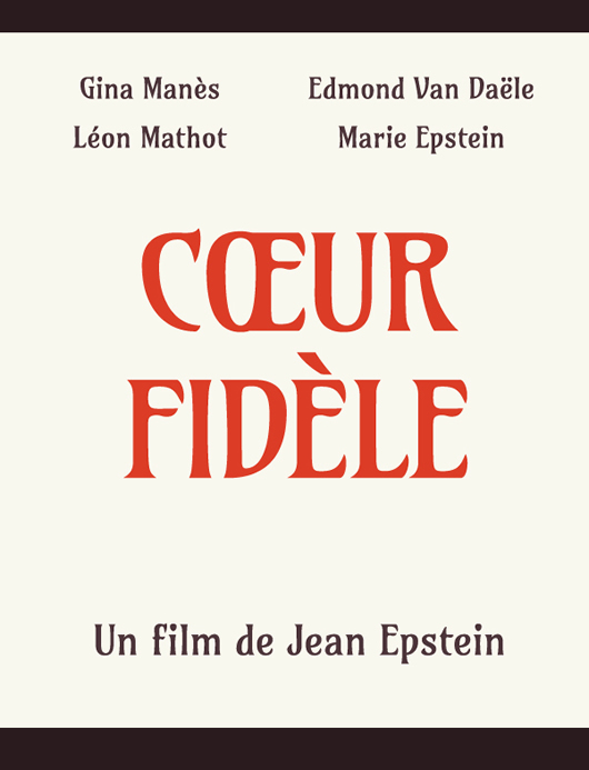
Arbutus

Arbutus is a sturdy medium contrast slab serif font with a faceted or spiked treatment. Arbutus is inspired by 19th Century American wood type. The generous spacing found in this design means that it can be used at fairly small sizes, which makes it surprisingly versatile.
You can see more of Karolinas work on her personal site TheKarolina or over on The Bechance Network