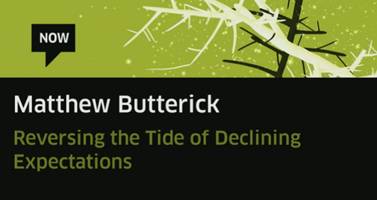
Matthew Butterick: Reversing the Tide of Declining Expectations, Watch Matthews talk from this years Typo talks.The migration of print media to electronic media is accelerating. But many electronic publishers are ignoring typography, creating a dangerous precedent for the future. Matthew Butterick…
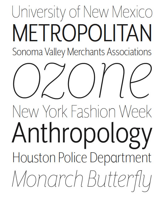
Mr Eaves XL Sans features a larger x-height than Mr Eaves Sans with shorter ascenders and descenders and overall tighter spacing. Mr Eaves XL allows for a wide variety of uses and is perfectly suitable for lengthy text settings. The larger x-height also maintains superior readability at smaller…
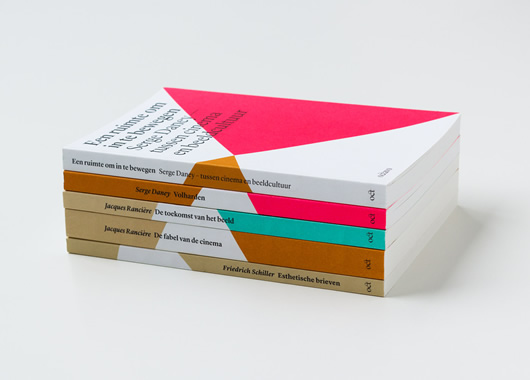
A beautifully simple collection of design and art publications by Atelier Carvalho Bernau for Amsterdam-based publishing house Octavo. Octavo publicaties publishes classic and contemporary texts at the intersection of philosophy and art theory. The challenge faced by the team at Atelier…
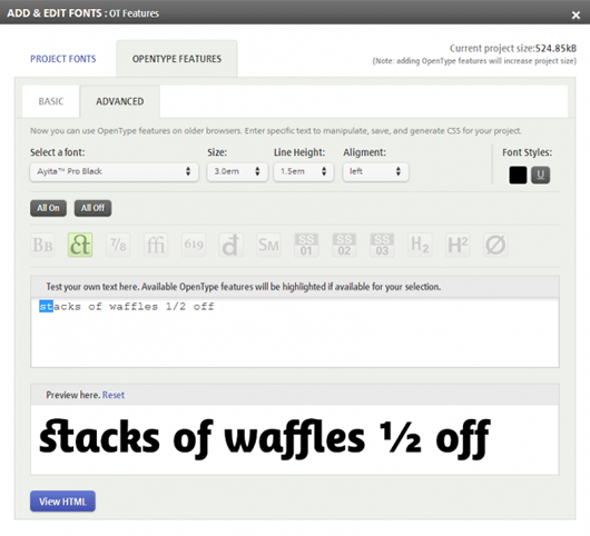
Great news this week from the team at fonts.com announcing new opentype features and extra control of the webfonts hosted with fonts.com The full featured list of options include, Swashes, Standard & Discretionary Ligatures, Fractions and Stylistic Alternates. As if this, along with the…
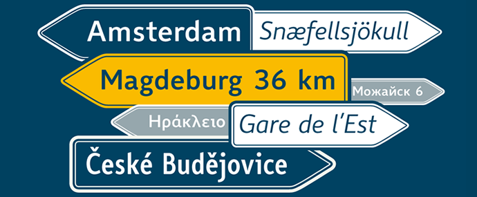
A project that has been over 7 years work from font designer Ralf Herrmann. After many years of intensive studies in the area of legibility and type design the result is Wayfinding Sans Pro, a complete and well considered universal typeface. Ralf studied and documented road signs in over 20…
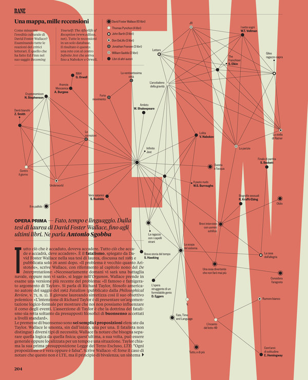
A wonderfully original piece of design work, great typographic elements throughout the booklet. The visual project of the section was developed by Francesco Muzzi under the supervision of Francesco Franchi. The masthead was custom made by Christian Schwartz. You can find more pages of Rane on…
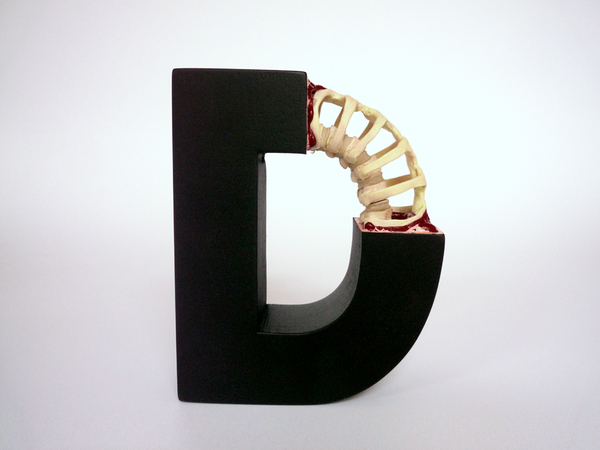
A somewhat morid but beautifully original art project by Andreas Scheiger from Vienna, Austria. Over a series of 21 exhibitions Andreas has created a large collection of work based on the concept of ‘evolution’, showing type evolving as if it where a living species and in his later…
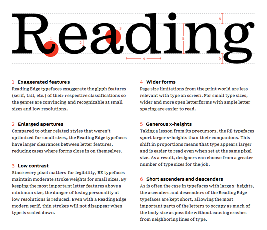
The reading edge is a fantastic and useful resource from the team at FontBureau, It contains a comprehensive guide for choosing the correct typeface for content heavy designs. The limitations of today’s screen-based media impose many restrictions on web typography. Even if a designer understands t…